Dollars & Good Sense Foundation
Transforming a non-profit website to empower low-income families through financial literacy
Team
Grace S (Content Designer)
Akeeksha K (Design Lead)
Luka L (UX Researcher)
Larry F (Software Developer)
My Role
UX & Interaction Designer
Interviews, IA, Wireframes, Prototyping, Dev Handoff
Tools
Figma & FigJam
Optimal Workshop
Notion
Timeline
10 Weeks
OVERVIEWDollars and Good Sense Foundation (DGSF) is a non-profit that provides financial literacy education to low-income families to break the cycle of generational poverty.
The Client
DGSF was struggling to communicate and scale their efforts due to the absence of a strong online presence. They were in need of a solution to address the following issues:
Minimal user engagement: Average of only 15-30 unique visitors per month
Low satisfaction ratings: Average of 1.8 out of 5.0 for website’s visual appeal, and 2.7 out of 5.0 for website’s ease of use
Lack of online registrations: Manual processing for over 90% of sign-ups
The Problem
Launched in February 2024
My team and I delivered a full website redesign that yielded the following results:
2.5x increase in satisfaction scores for ease of website use
88% reduction for time on task for program registration
The Impact
DGSF’s website was not serving user needs or business goals
UNDERSTANDING THE PROBLEMDGSF was experiencing low levels of website engagement and satisfaction, which hindered the organization’s ability to expand their reach and impact.
Cluttered layout, content, and visual design negatively impacted users' interactions with DGSF.
KEY RESEARCH INSIGHTSBy consolidating and analyzing the data from 6 usability tests, 3 user interviews, 3 stakeholder interviews, and 19 survey responses, we identified the following user pain points to solve for in the redesign:
Overwhelming content and presentation
The overflow of content and lack of organization made it difficult to find relevant information.
Obscured organizational
purpose and value
The absence of straightforward and consistent messaging left users confused about DGSF’s mission and target audience.
Difficulty establishing trust and credibility
The lack of cohesive visual and branding identity failed to present DGSF as a credible organization.
Restructuring the site to guide prospective program participants and supporters to relevant content.
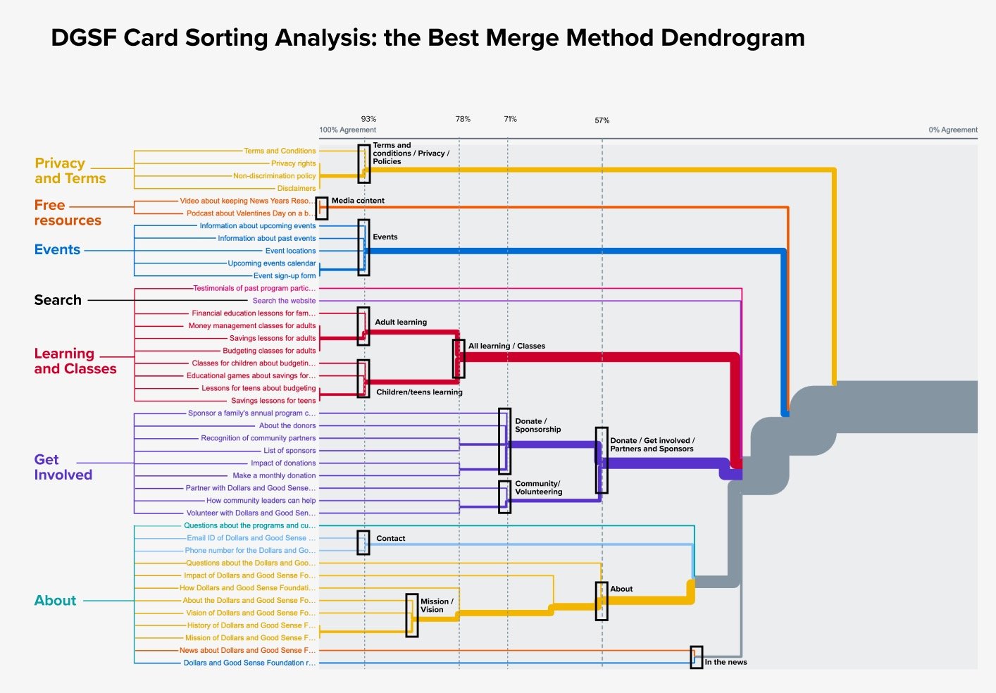
IDEATIONOne of the major undertakings of this project was to restructure how the content is organized. We conducted an open card sort exercise on OptimalSort with 23 participants to understand how target users interpret and categorize the site’s information.
To align with the mental models that surfaced from card sorting analysis, we proposed a new Information Architecture (IA) that grouped and connected the ways to support DGSF under “Get Involved,” and reduced the # of navigation items to 4.
We focused on the user journeys for two personas: (1) a prospective program participant seeking personal finance learning tools and guidance to improve their family's financial situation and (2) a potential donor / sponsor seeking ways to support a meaningful cause.
During this phase of the project, I primarily focused on reimagining how prospective participants learn about and register for programs, making sure to incorporate design elements that address the user needs and business goals identified through research.
Visualizing different ways to increase program discovery and streamline registration.
WIREFRAMINGQuick and easy access to relevant information about DGSF that minimizes cognitive load for the user
Clear messaging around DGSF's purpose and value
Signs of credibility that build a sense of trust in DGSF
User Needs
Divided content into digestible sections; highlighted backgrounds to direct users' attention to key info
Leveraged descriptive headers and straightforward language to communicate DGSF's role in community
Introduced a clean and consistent layout and incorporated testimonials from participants / donors
Resulting Design Decisions
Addressing confusion around the family-oriented programs and registration process.
TESTING & ITERATING
Viewing Program Information
After creating mid-fidelity interactive prototypes, we conducted 10 usability tests to validate our ideas then refined our designs based off our major findings.
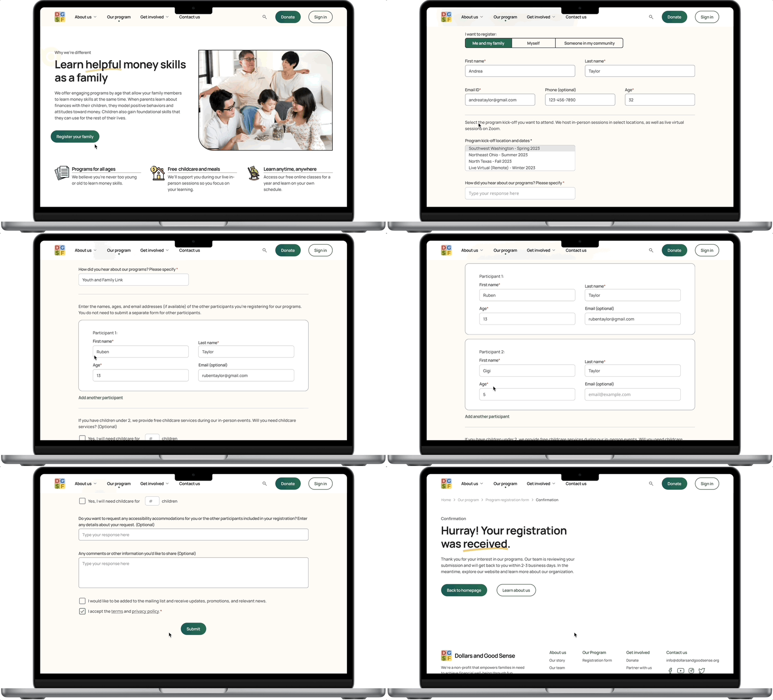
Registering for Programs
Aligning on branding and standardizing visual elements to achieve greater structure and consistency.
DESIGN SYSTEMIn order to address the website’s lack of visual consistency and appeal, which adversely impacted the organization’s credibility, while staying true to DGSF’s fun, family-friendly brand, we developed and applied a design system that balances professionalism with playfulness.
To gather design inspiration, we presented various web pages in the finance, education, and non-profit sectors to our client to determine what kinds of designs resonated with them and aligned with their goals and values.
Based on what our stakeholders favored, we strove for a clean, yet warm and welcoming look that incorporates fun and delightful elements, such as underlines, shapes, and icons/ illustrations.
Design Inspiration
Color Palette: mostly neutral colors, with some brighter accent colors for select elements on the site
Typeface: Manrope, to ensure readability and convey a sense of modernity and clarity
Imagery & Visuals: playful images and icons that are inviting to users of all ages and highlight the family-oriented nature of DGSF
Design System Decisions
Typography
Imagery & Visuals (sourced from Deposit Photos)
Colors
Icons (sourced from FlatIcon - Freepik)
Final Product
Condensed and segmented the information to avoid cognitive overload for users
Leveraged a clean, structured layout and text hierarchy to direct users to relevant content
Clear and easily digestible content
Developed a cohesive visual identity, with professional yet inviting colors and imagery, to establish credibility among users
Added dedicated sections for testimonials
Cohesive branding that builds trust
Updated CTAs to "Register your family" to set clear expectations for users upfront
Added segmented selections to give users the choice to fill out the form for themselves, their family, or on behalf of someone else
Utilized cards as a visual cue for users to register additional participants
Streamlined registration process
CONCLUSIONMy team and I presented the final redesign to DGSF’s executive leaders and received a very positive response. In addition to the hi-fi prototype, we prepared comprehensive documentation with details about the design system and specs to hand off to their developer for future implementation.
The DGSF team officially launched the redesigned website in February 2024, which yielded impressive results within the first 3 months:
1.5x increase in average monthly site traffic
18% increase in online registrations
📈 The Outcome
💬 Words from the Client
“Thank you for sharing your amazing transformation of our website! Our staff and board are so impressed by the quality of work you’ve delivered, and we’re confident that your efforts will help more families break the chains of financial chaos and walk toward a life of money wellness. Your impact will ripple for years to come.”
— Debbie Todd, President and CEO of Dollars and Good Sense Foundation
Check out more of my work!


